

How to Create a Custom Offcanvas Menu Using ReactJS
This article will teach you how to create a custom reusable offcanvas menu component using ReactJS, React Hooks and TailwindCSS.


Table of contents
Introduction
Understanding the Concept of an Offcanvas Menu
In frontend development, an offcanvas menu simply refers to a user interface design pattern or technique used to display content or navigation that is hidden from the main view and can be displayed by triggering a specific action such as clicking a button or swiping on a mobile device.
Offcanvas menus are often used to display navigation menus, sidebar panels, or additional information that are not immediately essential but can easily be accessed when needed. This way, as a frontend developer or product designer, you are maintaining an uncluttered interface and providing a seamless user experience by keeping the additional content out of the way until the user has requested it.
Offcanvas menus generally improve the usability and user experience of your website or application across all screen sizes.
Examples of real-life scenarios and use cases where you will find an offcanvas menu being employed are:
Mobile-responsive navigation bars: Offcanvas menus are frequently used in responsive web design to provide accessible navigation on mobile devices. This is achieved by hiding the navbar and displaying it when a button is clicked.
Sidebar Navigation: In most desktop applications today, an offcanvas menu has proved to be effective for displaying content. Sidebar links, user profile information, settings, and so on.
At the end of this article, you should be able to create a custom reusable offcanvas menu component suitable for your personal and commercial projects.
Overview of the Technologies to be Used
Very quickly, let’s do a run-through of the three technologies we’ll use to achieve our objective in this project: ReactJS, TailwindCSS, and Vite.
ReactJS: ReactJS is a javascript library for building user interfaces. React makes it super easy to break down your application into smaller components, manage their state, and update and render just the right component when data changes.
TailwindCSS: A utility-first CSS framework that helps you rapidly build modern websites without ever having to leave your HTML.
Vite: Vite (pronounced as veet) is simply a build tool that aims to provide a faster and leaner development experience for modern web projects. We will set up our project using Vite as it is relatively faster than its alternative; create-react-app.
Prerequisites
This article assumes that you have:
A basic understanding of TailwindCSS.
An understanding of the fundamentals of ReactJS (JSX, passing props, managing state, etc)
NodeJS installed.
What We'll Build
Visit the link https://react-offcanvas-app.vercel.app/ to see the Live URL of the application we'll build in this tutorial. The GitHub repository can also be found here.
Building the Offcanvas Menu
Creating a New React Project
I believe you have the latest edition of NodeJS installed on your computer. However, if you don’t have it installed already, proceed to their website nodejs.org and install the latest stable version which at the time of writing is 18.16.1.
Let's go ahead to create our React project. At this point, navigate to the directory on your computer you will like your project to be located and run the command below
npm create vite@latest
After running this command, you will get a prompt that requires you to enter the name of the project, select a framework, and select a variant. Let's name our project react-offcanvas. For the framework and variant, choose React and JavaScript respectively.
√ Project name: ... react-offcanvas
√ Select a framework: » React
√ Select a variant: » JavaScript
We have successfully installed Vite on your project. Next in the installation process is to navigate to your new project and install the node modules. Run the following command to achieve this.
cd react-offcanvas && npm install
Now that our project has been successfully created, let's proceed to install TailwindCSS. TailwindCSS is fast, flexible, and reliable to work with. You can read the official documentation about the installation process on the official Tailwind docs or follow along with this article.
Firstly, we'll start by installing tailwindcss via npm and creating our tailwind.config.js and postcss.config.js files respectively. Run the following commands.
> npm install -D tailwindcss postcss autoprefixer
> npx tailwindcss init -p
Next, replace your newly created tailwind.config.js file with the code block below.
/** @type {import('tailwindcss').Config} */
export default {
  content: [
    "./index.html",
    "./src/**/*.{js,ts,jsx,tsx}",
  ],
  theme: {
    extend: {},
  },
  plugins: [],
}
Next, navigate to the /src folder in your project directory and replace the content of your index.css file with the @tailwind directives.
@tailwind base;
@tailwind components;
@tailwind utilities;
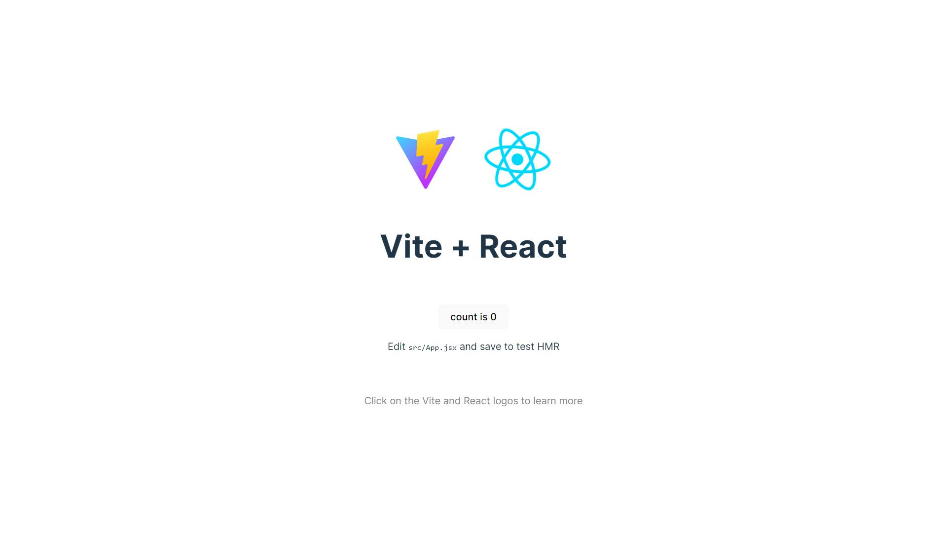
Voila 🎉! Our react project has been created and TailwindCSS has been installed successfully. To view the result so far, run the command: npm run dev and you should see this below:
Creating the Offcanvas Menu Component
Let's assume you are required to build a landing page for a tech startup to be launched sometime in the future. However, this startup needs you to create a waitlist site for their early adopters to sign up to know when this product is launched. Our task:
Design a basic landing page with a call to action button that triggers the offcanvas menu.
Styling and customizing the offcanvas menu.
Creating our basic landing page
Navigate to the /src folder in your project directory and create a new folder called components. In your components folder, create the following files
LandingPage.jsxOffCanvasMenu.jsxButton.jsx
On our LandingPage, add the following block of code
// LandingPage.jsx

import React from "react";
import ReactLogo from "./../assets/react.svg";

const LandingPage = () => {
  return (
    <div className="flex flex-col justify-center items-center h-screen">
      <div>
        <img src={ReactLogo} alt="React Logo" />
      </div>
      <div className="text-center w-3/5">
        <h1 className="font-bold text-6xl mt-12 text-zinc-600">
          Be the first to know when our amazing product is launched.
        </h1>
        <p className="mt-5 text-black text-opacity-50 w-3/4 m-auto">
          Spectre is an ambitous startup that is seeking to disrupt the
          logistics tech industry. Moving goods from point A to B will become a
          thing of the past. We is building something great. We cannot wait to
          show the world what we've been cooking.
        </p>
      </div>
    </div>
  );
};

export default LandingPage;
We have simply added a couple of TailwindCSS classes to create a basic landing page. Next, we are going to create our button which will trigger the OffCanvas menu component when clicked.
In your Button.jsx file, add the following code block
// Button.jsx

export const Button = ({ btnText, bgColor, onClick }) => {
  return (
    <button
      className={`${bgColor} text-white rounded-lg px-8 py-3`}
      onClick={onClick}
    >
      {btnText}
    </button>
  );
};
In the Button.jsx file above, we have passed 3 props named btnText, bgColor, and onClick. This makes it possible to reuse this Button anywhere on this project. Now, we'll need to import our Button to our Landing page component. Go ahead and update your LandingPage.jsx file with the code block below:
// LandingPage.jsx

import React from "react";
import ReactLogo from "./../assets/react.svg";
import { Button } from "./Button";

const LandingPage = () => {
  return (
    <div className="flex flex-col justify-center items-center h-screen">
      <div>
        <img src={ReactLogo} alt="React Logo" />
      </div>
      <div className="text-center w-3/5">
        <h1 className="font-extrabold text-6xl mt-12 text-zinc-600">
          Be the first to know when our amazing product is launched.
        </h1>
        <p className="mt-5 text-black text-opacity-50 w-3/4 m-auto">
          Spectre is an ambitous startup that is seeking to disrupt the
          logistics tech industry. Moving goods from point A to B will become a
          thing of the past. We is building something great. We cannot wait to
          show the world what we've been cooking.
        </p>
      </div>
      <div className="mt-12">
        <Button btnText="Join our waitlist" bgColor="bg-zinc-700" />
      </div>
    </div>
  );
};

export default LandingPage;
We're making progress. Now, let's see the result of running the code we've written so far. If you go to the address bar on your browser and visit localhost:5173, you should see this:
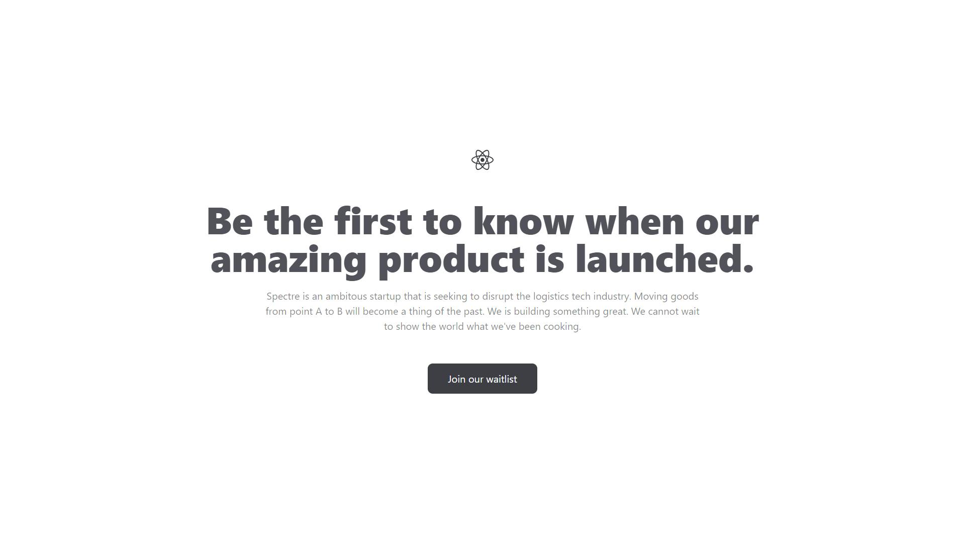
So far, we've designed our basic landing page and added a button to trigger the offcanvas menu. Next, we'll proceed to style and customize our offcanvas and display it when the user clicks the button.
To achieve this, we will be working with a React hook called useState. React Hooks are JavaScript functions that allow you to manage the state's behavior and other React features in a functional component. They were introduced in React in version 16.8 and have since eliminated the use of class-based components in React applications.
The useState() hook is used to manage states. It returns a stateful value and an updater function to update the state.
On our LandingPage.jsx file, we'll create our state to show and hide the offcanvas menu and a function to update the state when the user requests it. See the code below:
// LandingPage.jsx

import React, { useState } from "react";
import ReactLogo from "./../assets/react.svg";
import { Button } from "./Button";

const LandingPage = () => {
  const [showOffCanvas, setShowOffCanvas] = useState(false);

  const toggleOffCanvas = () => {
    setShowOffCanvas(!showOffCanvas);
  };

  return (
    <div className="flex flex-col justify-center items-center h-screen">
      <div>
        <img src={ReactLogo} alt="React Logo" />
      </div>
      <div className="text-center w-3/5">
        <h1 className="font-extrabold text-6xl mt-12 text-zinc-600">
          Be the first to know when our amazing product is launched.
        </h1>
        <p className="mt-5 text-black text-opacity-50 w-3/4 m-auto">
          Spectre is an ambitous startup that is seeking to disrupt the
          logistics tech industry. Moving goods from point A to B will become a
          thing of the past. We is building something great. We cannot wait to
          show the world what we've been cooking.
        </p>
      </div>
      <div className="mt-12">
        <Button btnText="Join our waitlist" bgColor="bg-zinc-700" />
      </div>
    </div>
  );
};

export default LandingPage;
Firstly, we imported the { useState } hook from our React library. Then we initialized our state variable with an updater function to update the state. By default, our offcanvas will be hidden hence, the initialized value is false. Finally, we created a toggleOffCanvas() function to update the showOffCanvas state. Since our initialized value is false, when the function is called, it changes its value to true and when it is true, it updates the value of the state to false.
Recall, in our Button.jsx component, we passed 3 props: btnText, bgColor, and onClick. In our LandingPage.jsx component where we have written the toggleCanvas function to handle the click event, we'll call the function.
Simply update the LandingPage.jsx component with the block of code below.
// LandingPage.jsx

import React, { useState } from "react";
import ReactLogo from "./../assets/react.svg";
import { Button } from "./Button";

const LandingPage = () => {
  const [showOffCanvas, setShowOffCanvas] = useState(false);

  const toggleOffCanvas = () => {
    setShowOffCanvas(!showOffCanvas);
  };

  return (
    <div className="flex flex-col justify-center items-center h-screen">
      <div>
        <img src={ReactLogo} alt="React Logo" />
      </div>
      <div className="text-center w-3/5">
        <h1 className="font-extrabold text-6xl mt-12 text-zinc-600">
          Be the first to know when our amazing product is launched.
        </h1>
        <p className="mt-5 text-black text-opacity-50 w-3/4 m-auto">
          Spectre is an ambitous startup that is seeking to disrupt the
          logistics tech industry. Moving goods from point A to B will become a
          thing of the past. We is building something great. We cannot wait to
          show the world what we've been cooking.
        </p>
      </div>
      <div className="mt-12">
        <Button
          btnText="Join our waitlist"
          bgColor="bg-zinc-700"
          onClick={toggleOffCanvas}
        />
      </div>
    </div>
  );
};

export default LandingPage;
To see what's happening under the hood, you could simply console.log(showOffCanvas) just below the toggleOffCanvas() function. Next, we'll create our OffCanvas component that will be displayed when the user clicks on the button on the Landing Page.
Customizing and Styling the OffCanvas Menu Component
Navigate to the OffCanvasMenu.jsx component and paste the block of code given below:
// OffCanvasMenu.jsx

import React from "react";

const OffCanvasMenu = ({
  title,
  description,
  component,
  width,
  postition,
  onRequestClose,
}) => {
  return (
    <div className="absolute right-0 bg-black/[0.65] w-full h-screen">
      <div
        className={`bg-white px-8 py-12 ${width} absolute ${postition} h-screen`}
      >
        <div
          className="flex justify-end items-end mb-4 w-6 ml-auto rounded-full cursor-pointer"
          onClick={onRequestClose}
        >
          <svg
            xmlns="http://www.w3.org/2000/svg"
            width="24"
            height="24"
            viewBox="0 0 24 24"
            fill="none"
          >
            <path
              d="M12 22c5.5 0 10-4.5 10-10S17.5 2 12 2 2 6.5 2 12s4.5 10 10 10ZM9.17 14.83l5.66-5.66M14.83 14.83 9.17 9.17"
              stroke="#6B6B6B"
              strokeWidth="1.5"
              strokeLinecap="round"
              strokeLinejoin="round"
            ></path>
          </svg>
        </div>
        <h4 className="text-3xl font-bold">{title}</h4>
        <p className="text-black text-opacity-70">{description}</p>
        <div className="mt-12">{component}</div>
      </div>
    </div>
  );
};

export default OffCanvasMenu;
In the code above, we have passed 6 props to the component namely:
title: The title of our Offcanvas menu component. Since we're creating an offcanvas to handle our waitlist form, we can title it "Join our waitlist".description: A short description to accompany the title of our Offcanvas menu.component: What content will be contained in the Offcanvas menu.width: A tailwindcss class to specify the width of our Offcanvas depending on your needs.position: A tailwindcss class to specify the position of our Offcanvas.onRequestClose: A function to be triggered when the user clicks on the close svg icon. This will be the same function as thetoggleOffCanvas.
Also, you may come across this TailwindCSS class name: bg-black/[0.65]. What this does is simply add a dark backdrop to the screen when the offcanvas menu has been triggered.
The next step is to import our Offcanvas menu to the Landing page component and write a logic to display it when the user clicks the button and close it when the user clicks the svg icon. Go ahead and update your LandingPage.jsx component with the code below
// LandingPage.jsx

import React, { useState } from "react";
import ReactLogo from "./../assets/react.svg";
import { Button } from "./Button";
import OffCanvasMenu from "./OffCanvasMenu";

const LandingPage = () => {
  const [showOffCanvas, setShowOffCanvas] = useState(false);

  const toggleOffCanvas = () => {
    setShowOffCanvas(!showOffCanvas);
  };

  return (
    <>
      {showOffCanvas && (
        <OffCanvasMenu
          title="Join our waitlist"
          description="Be the first to know when we launch"
          width="w-1/3"
          postition="right-0" /* Use 'left-0' to position the offcanvas menu to the left. */
          onRequestClose={toggleOffCanvas}
        />
      )}
      <div className="flex flex-col justify-center items-center h-screen">
        <div>
          <img src={ReactLogo} alt="React Logo" />
        </div>
        <div className="text-center w-3/5">
          <h1 className="font-extrabold text-6xl mt-12 text-zinc-600">
            Be the first to know when our amazing product is launched.
          </h1>
          <p className="mt-5 text-black text-opacity-50 w-3/4 m-auto">
            Spectre is an ambitous startup that is seeking to disrupt the
            logistics tech industry. Moving goods from point A to B will become
            a thing of the past. We is building something great. We cannot wait
            to show the world what we've been cooking.
          </p>
        </div>
        <div className="mt-12">
          <Button
            btnText="Join our waitlist"
            bgColor="bg-zinc-700"
            onClick={toggleOffCanvas}
          />
        </div>
      </div>
    </>
  );
};

export default LandingPage;
We've specified the respective values for our props in the OffCavnasMenu above. A width of 33% (you could use any TailwindCSS class for yours) has been provided and we have positioned our OffCanvas menu to the right of our screen. Also, at the point where the OffCanvas is being displayed, that means our showOffcanvas state is true. We've called the toggleOffCanvas function to the onRequestClose prop to change the value to false. This will hide our Offcanvas.
Let's view the result on our browser. Visit localhost:5173 and when you click the button on the screen, you should see your OffCanvas menu component. Something like this:
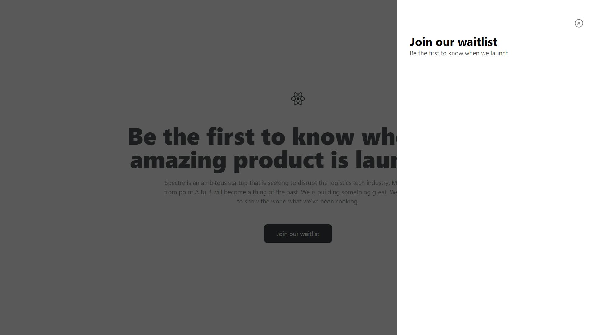
Congratulations! Your custom reusable offcanvas menu component has been created successfully. When you click on the close icon, it hides the OffCanvas and when you click on the button, it displays the OffCanvas. That's great!
Our final step is to create our Waitlist form and call it in the component prop specified in the OffCanvasMenu.jsx component.
Create a new file called WaitlistForm.jsx in the /src directory and paste the following block of code:
// WaitlistForm.jsx

import React from "react";
import { Button } from "./Button";

const WaitlistForm = () => {
  return (
    <form>
      <div className="mt-5">
        <label className="font-semibold text-sm text-gray-700">
          Your full name
        </label>
        <div>
          <input
            type="text"
            name="full_name"
            className="p-4 w-full bg-gray-100 text-sm rounded-md mt-2 focus:outline-none"
            placeholder="Enter your first name"
          />
        </div>
      </div>
      <div className="mt-5">
        <label className="font-semibold text-sm text-gray-700">
          Your email
        </label>
        <div>
          <input
            type="email"
            name="email"
            className="p-4 w-full bg-gray-100 text-sm rounded-md mt-2 focus:outline-none"
            placeholder="Enter your email"
          />
        </div>
      </div>
      <div className="mt-5">
        <Button btnText="Submit" bgColor="bg-zinc-700" />
      </div>
    </form>
  );
};

export default WaitlistForm;
Here, we have created our form with two input fields: full name and email. We have also imported our Button component to the waitlist form. (Note: You can create a new component called InputField.jsx in the components directory to handle your form input. You could pass props such as the label name, input type, input name and placeholder to prevent code repetition and improve code readability.
Finally, import the WaitlistForm component into the LandingPage component and pass it as the value of the prop in the OffCanvasMenu component. Like this
// LandingPage.jsx

import React, { useState } from "react";
import ReactLogo from "./../assets/react.svg";
import { Button } from "./Button";
import OffCanvasMenu from "./OffCanvasMenu";
import WaitlistForm from "./WaitlistForm";

const LandingPage = () => {
  const [showOffCanvas, setShowOffCanvas] = useState(false);

  const toggleOffCanvas = () => {
    setShowOffCanvas(!showOffCanvas);
  };

  return (
    <>
      {showOffCanvas && (
        <OffCanvasMenu
          title="Join our waitlist"
          description="Be the first to know when we launch"
          width="w-1/3"
          postition="right-0" /* Use 'left-0' to position the offcanvas menu to the left. */
          component={<WaitlistForm />}
          onRequestClose={toggleOffCanvas}
        />
      )}
      <div className="flex flex-col justify-center items-center h-screen">
        <div>
          <img src={ReactLogo} alt="React Logo" />
        </div>
        <div className="text-center w-3/5">
          <h1 className="font-extrabold text-6xl mt-12 text-zinc-600">
            Be the first to know when our amazing product is launched.
          </h1>
          <p className="mt-5 text-black text-opacity-50 w-3/4 m-auto">
            Spectre is an ambitous startup that is seeking to disrupt the
            logistics tech industry. Moving goods from point A to B will become
            a thing of the past. We is building something great. We cannot wait
            to show the world what we've been cooking.
          </p>
        </div>
        <div className="mt-12">
          <Button
            btnText="Join our waitlist"
            bgColor="bg-zinc-700"
            onClick={toggleOffCanvas}
          />
        </div>
      </div>
    </>
  );
};

export default LandingPage;
Conclusion
In this tutorial, we created a customizable reusable offcanvas menu component using ReactJS, which you can use in your personal and future projects.
If you found this article helpful, please like, comment and share to your community of frontend developers who might need this. You can connect with me on LinkedIn, Twitter, GitHub, and Instagram.